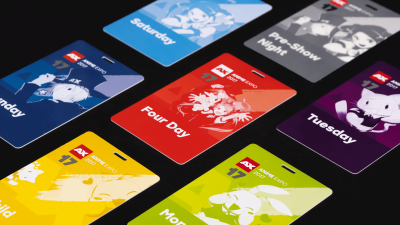
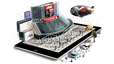
Anime Expo – Website Redesign

Delight users. Sell tickets. Create community.

Anime Expo is the largest anime and manga convention in North America. Hundreds of thousands of fans flock to the event hosted at the Los Angeles Convention Center. Apart from the convention itself, the Anime Expo website serves as the main touchpoint and information thoroughfare for fans year round.

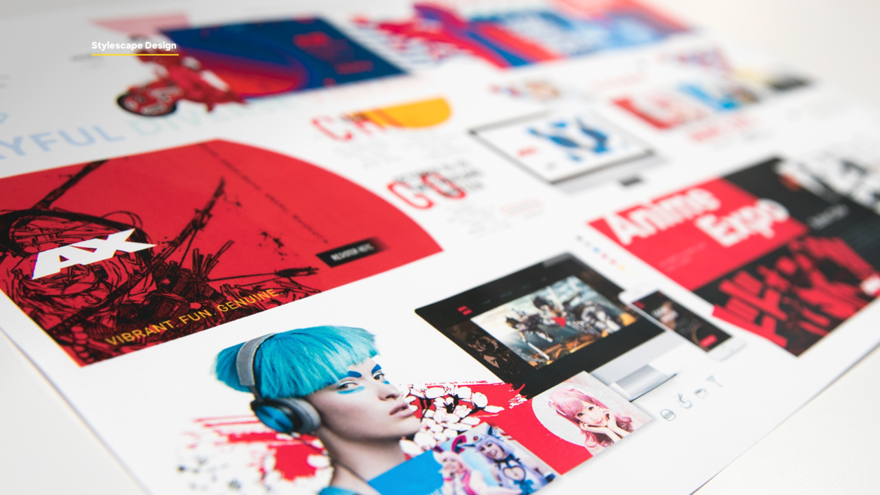
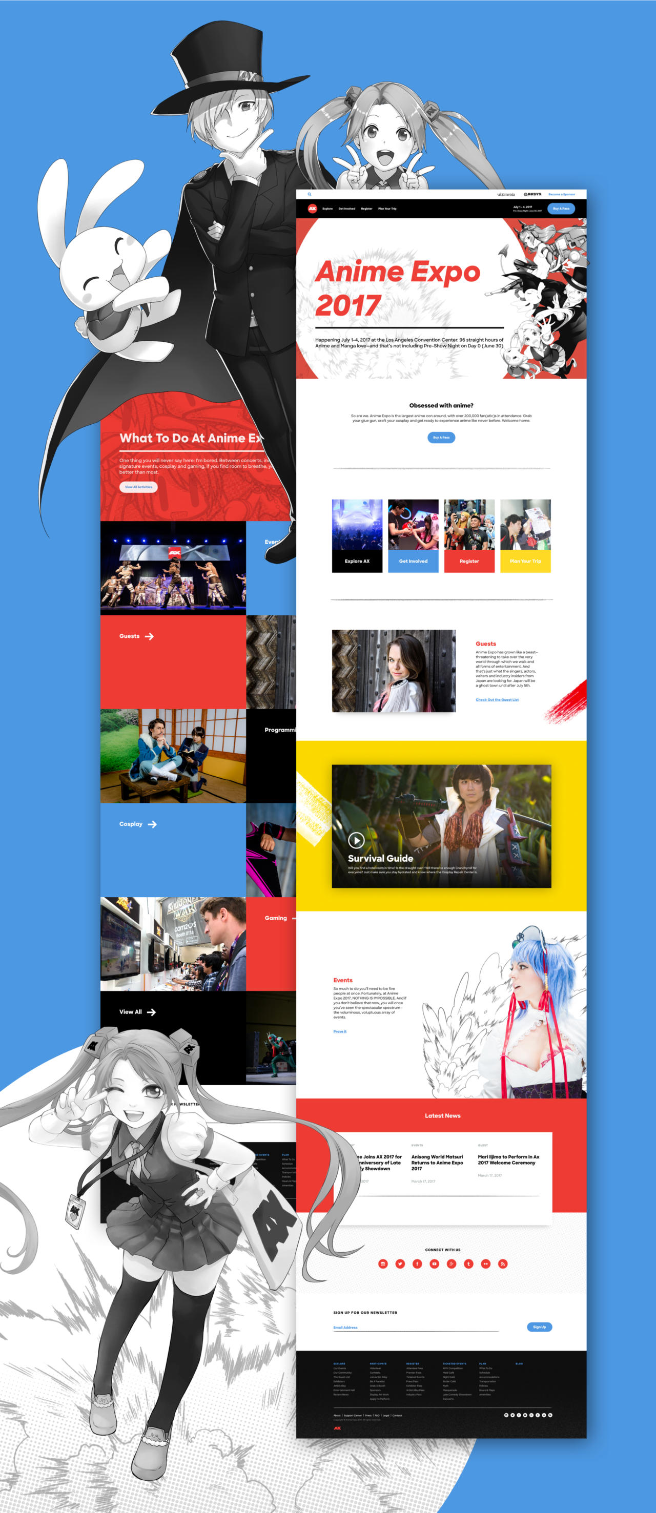
The leadership team at Anime Expo were driven to refresh the site design, align the website to the new brand identity that Blind crafted, and to improve the way their users find and discover information about the event.
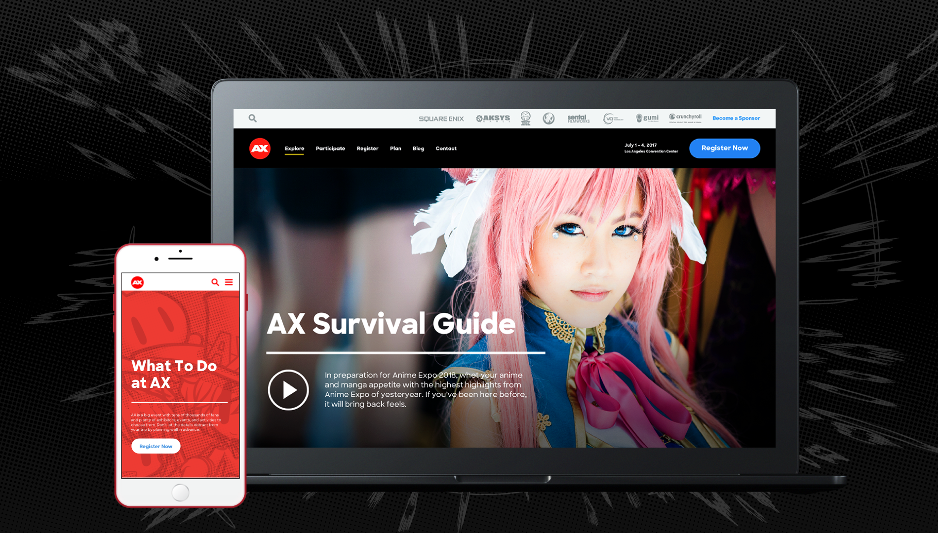
anime-expo.org

Creating an Incredible
User Experience.

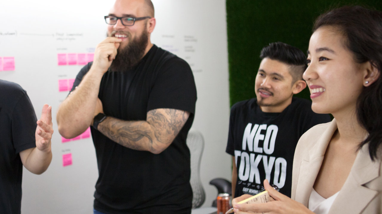
Designing user experiences that delight is a difficult task. It takes a highly skilled team of experts: user experience strategists, user interface designers, copywriters, photographers, and engineers. Blind assembled a team of specialist to craft and optimize the anime-expo.org user experience.

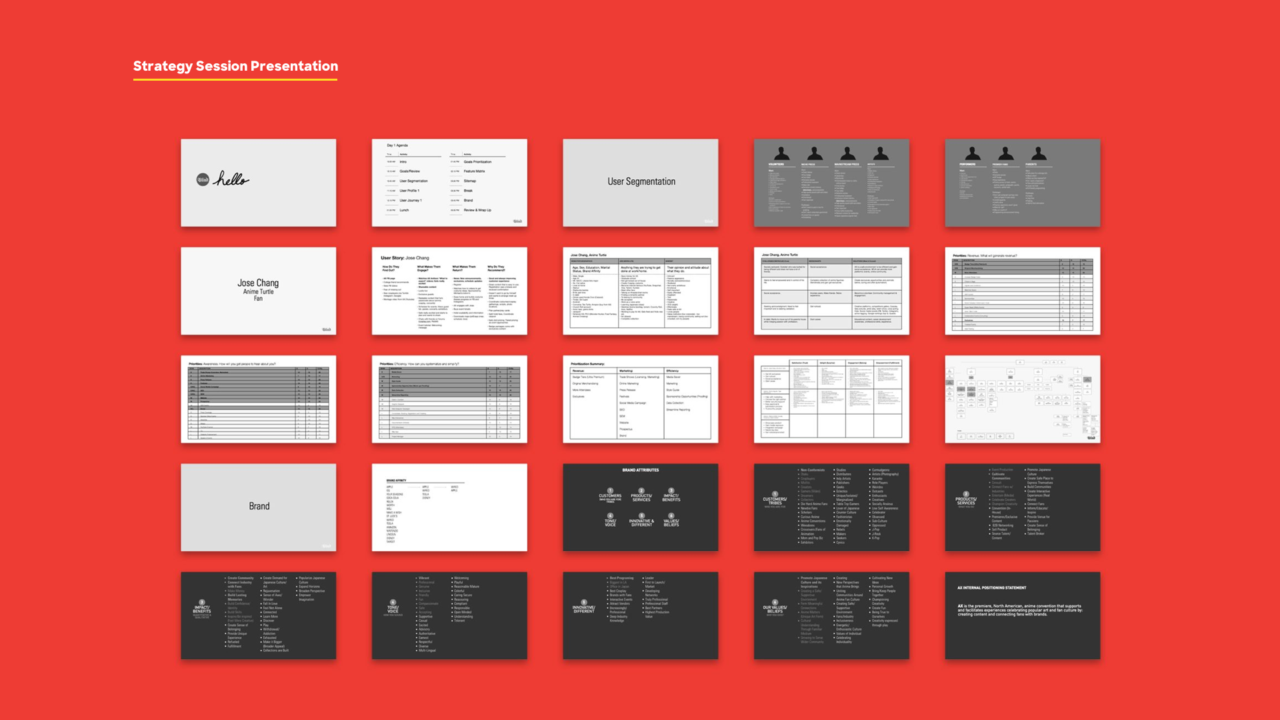
Kicking things off with a solid strategy.

At the core of every Blind project lies a concrete strategy. Whether we are crafting a new brand identity, an award-winning video, or in this case, an effective and delightful user experience, every project starts with a plan.

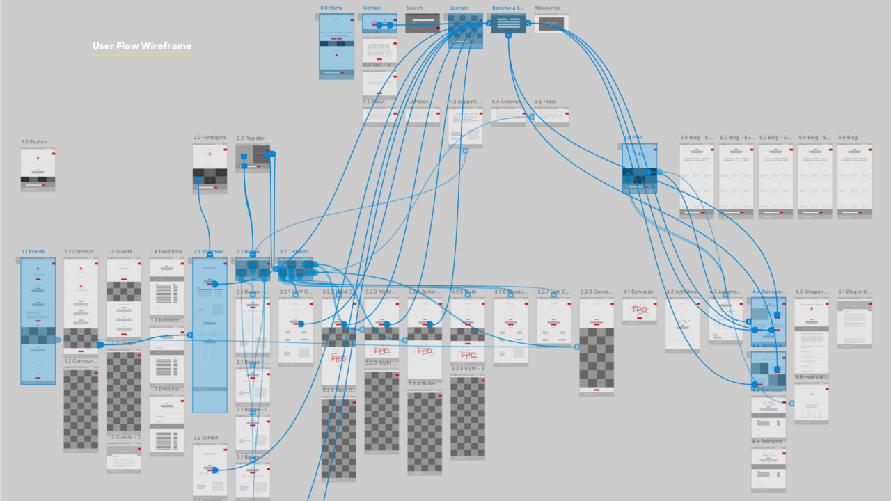
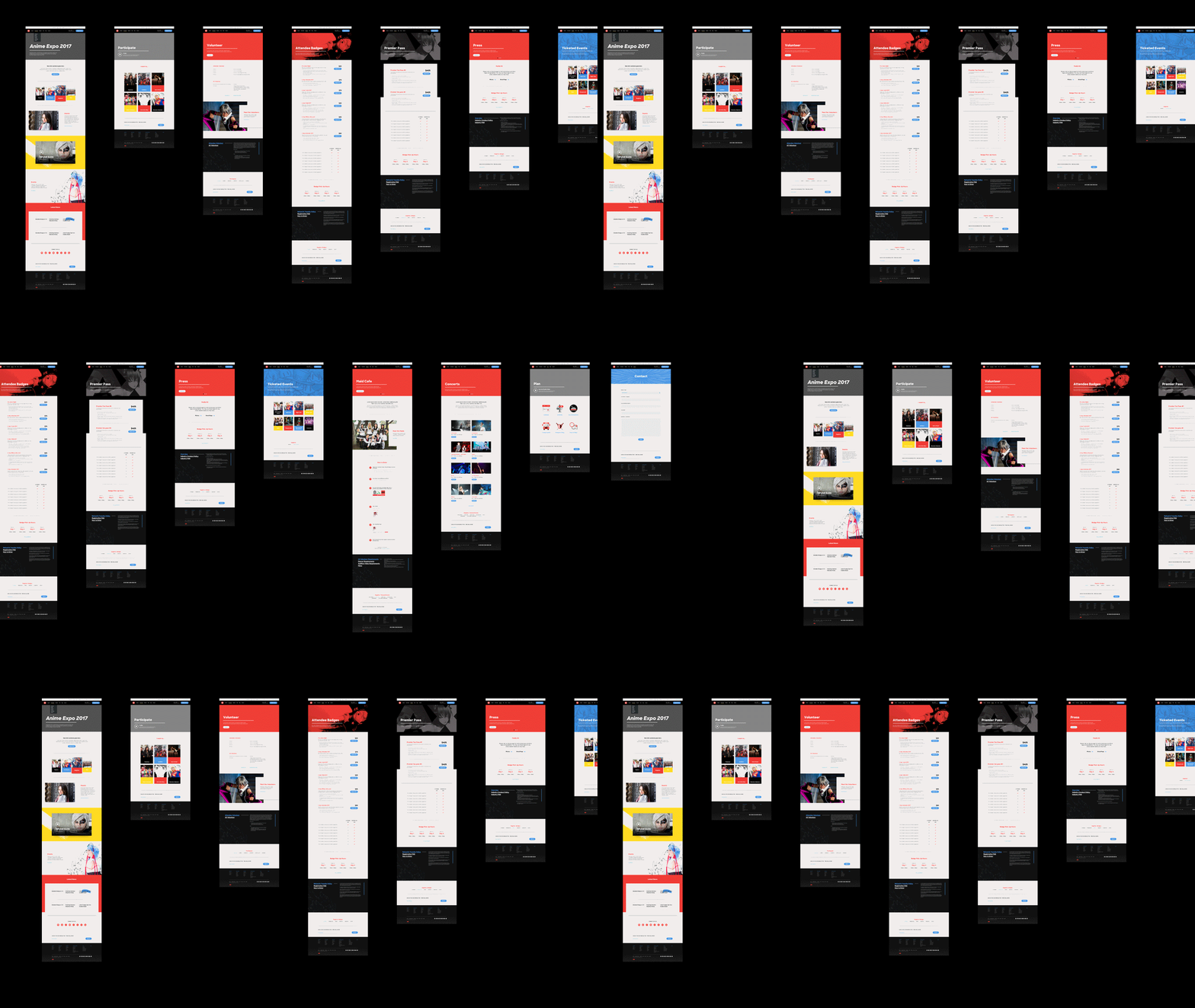
We worked closely with the Anime Expo leadership and marketing teams to develop user profiles, journeys and stories, then applied these to a new navigation structure and information architecture.

Read more about the AX brand strategy.

The unique Anime Expo UX challenge.

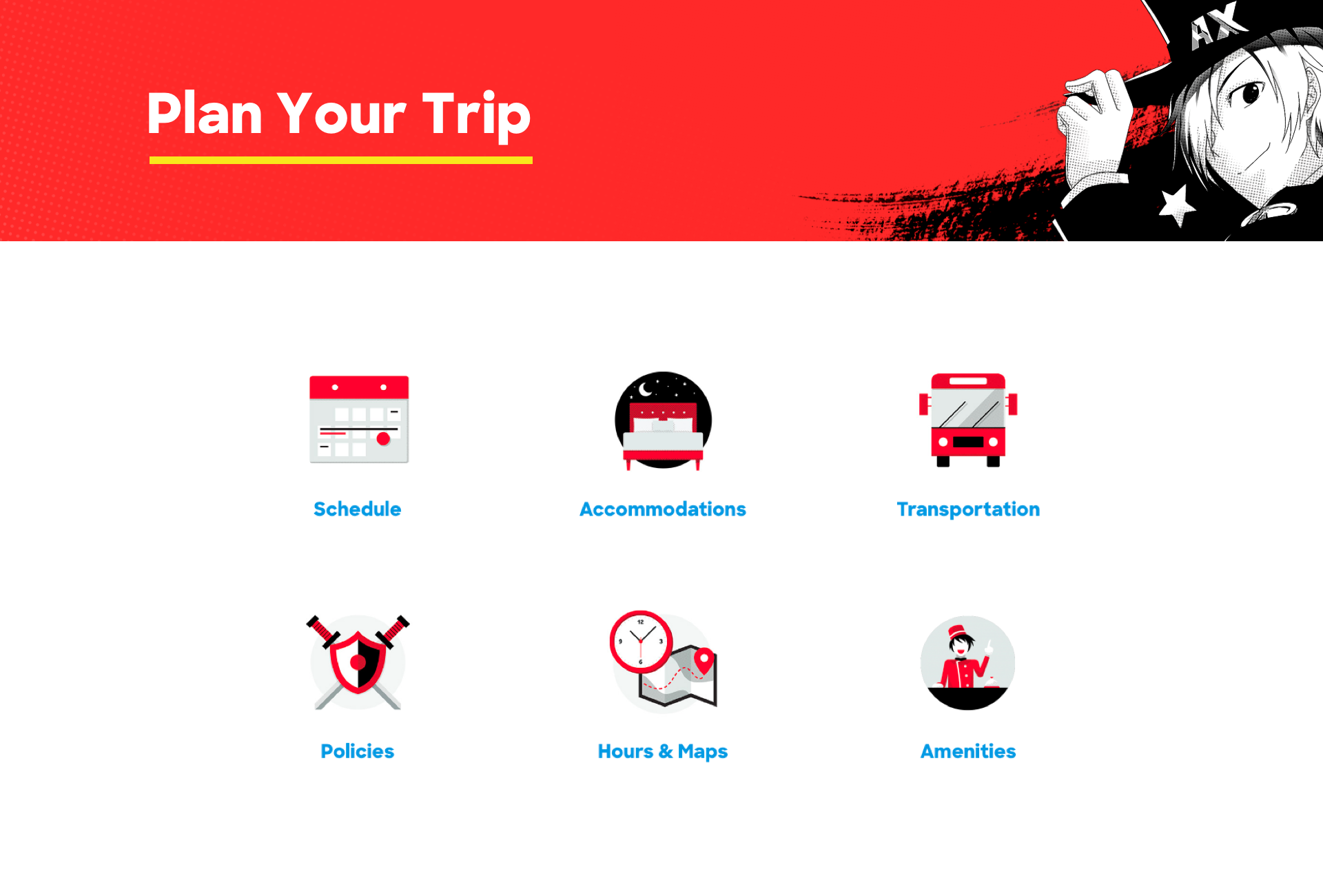
Every great digital product strikes a fine balance between business goals and user needs. The Anime Expo site was no different. While the overarching business goal was to make it easier for users to buy tickets to the event, there were several user goals that needed to be addressed and accomplished. We were able to strike a nice balance between driving sales, helping users plan for the conference and explore the various events held within.

By preparing users for the conference ahead of time, we were able to improve their experience while attending Anime Expo.


Great UX equals delighted users.

Since the site’s launch in October 2017, anime-expo.org has seen a dramatic reduction in bounce rate: over 23% in comparison to the previous month. In addition to bounce rates improving, we increased overall page views by over 184%. These metrics demonstrate that users are finding what they need easier than ever.


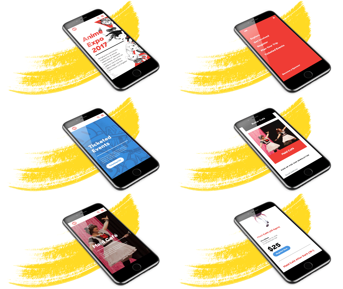
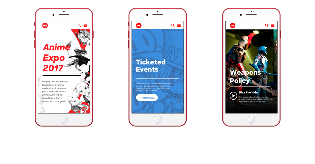
Mobile minded design.


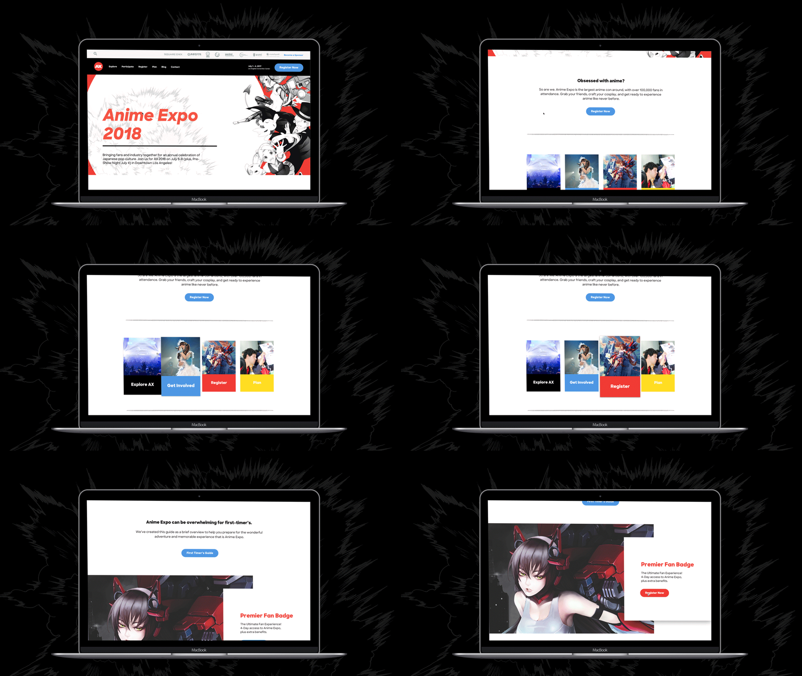
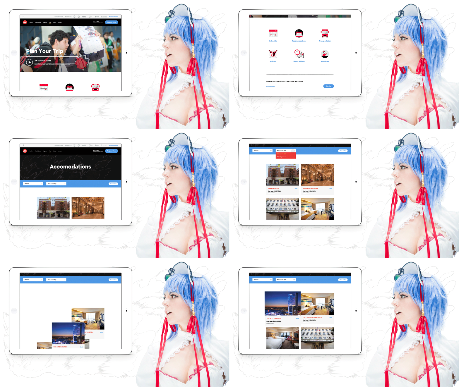
A significant percentage of Anime Expo's traffic consists of viewers on mobile devices. One of our primary goals was to craft the user interface design to be modular, in order to achieve perfect responsiveness, no matter the screen size.

Want to work with us?

Start a Project

Credits

  • Client

    SPJA

  • Client CEO

    Mark Manansala

  • Client Creatives

    Jeremiah Fajardo (Entertainment Manager), Yohanes Fadillah (Project Manager), Dino Martin (Brand Manager), Meg Tsuruda (Branding Coordinator), Marissa Mekvichitsaeng (HR Information Systems Manager)

  • Production Company

    Blind

  • Executive Creative Director

    Chris Do

  • DIRECTOR

    Ben Burns

  • Creative Director

    Matthew Encina

  • Digital Director

    Ben Berns

  • Executive Producer

    Scott Rothstein

  • Art Director

    Jaime Van Wart

  • Senior Designer

    Sang Chung

  • Designer

    Emily Xie

  • Project Manager

    Daisy Zarazua

  • Developer

    html Boutique

  • Software

    Adobe Photoshop, Adobe Illustrator, Adobe XD, Sketch