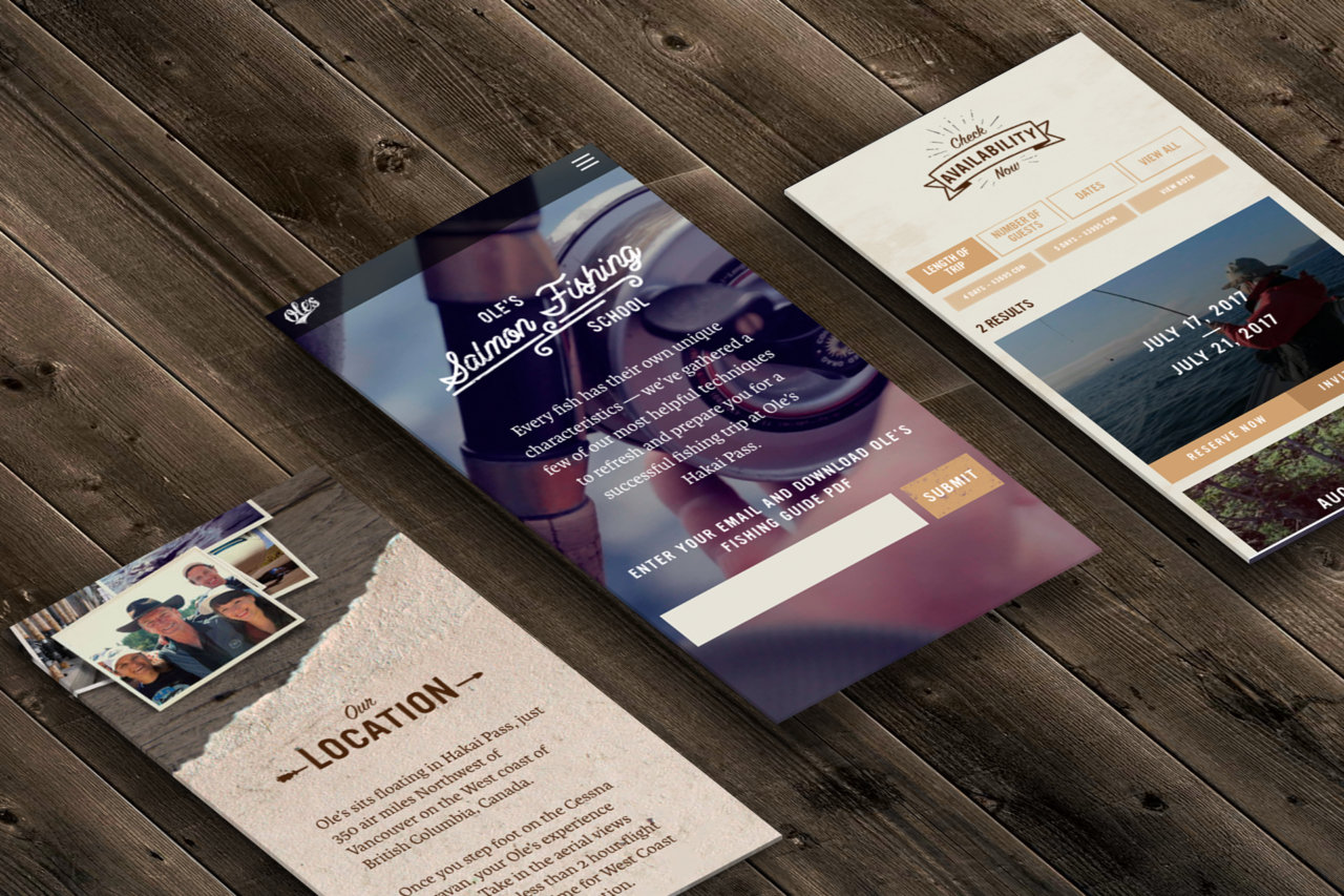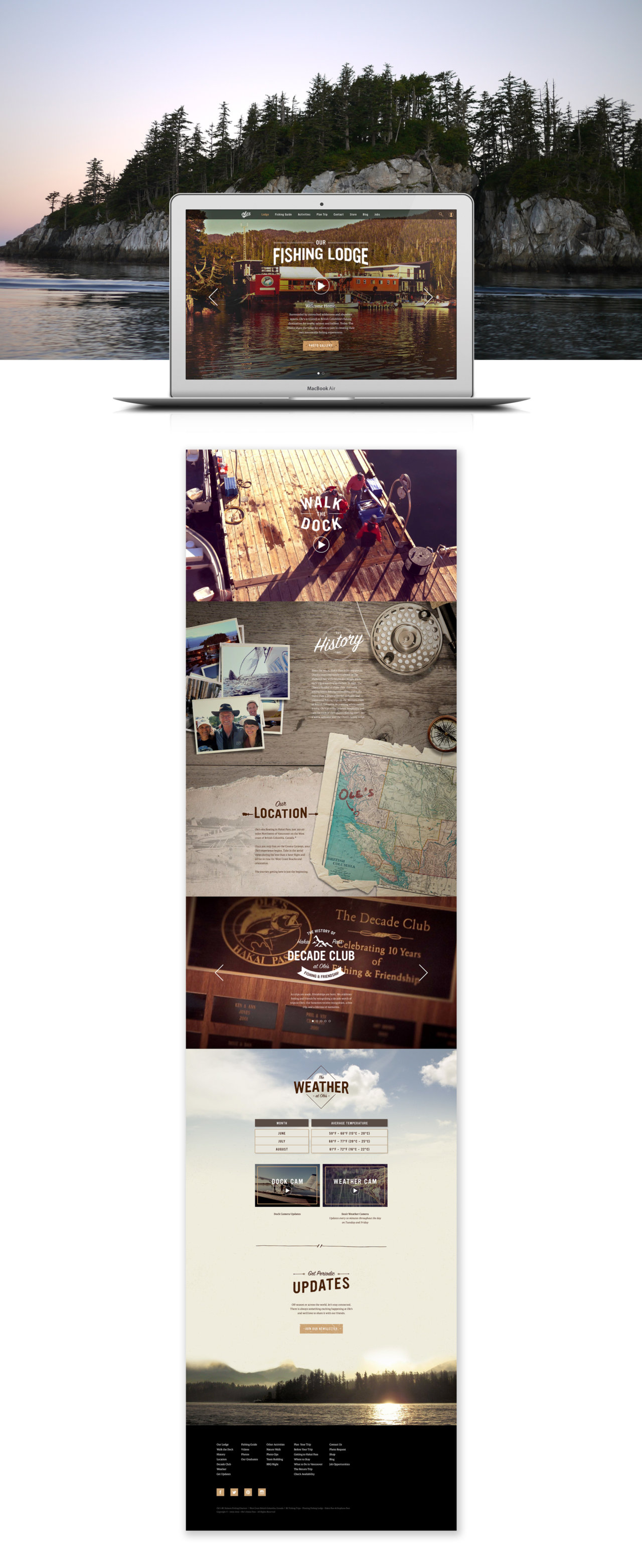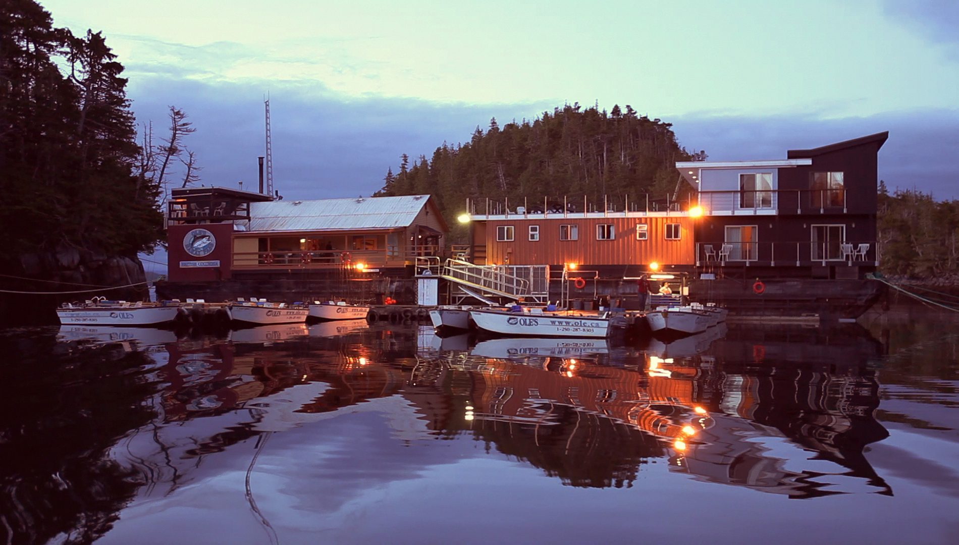
Ole’s Hakai Fishing Lodge
THE CHALLENGE
Make the digital user experience match the high touch feel of this quaint, family owned, fishing lodge and increase the visibility of the Ole’s brand.
OUTCOME
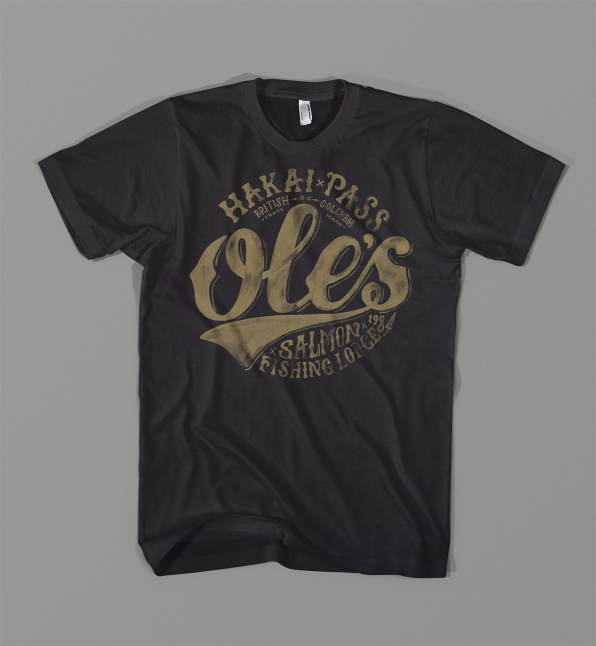
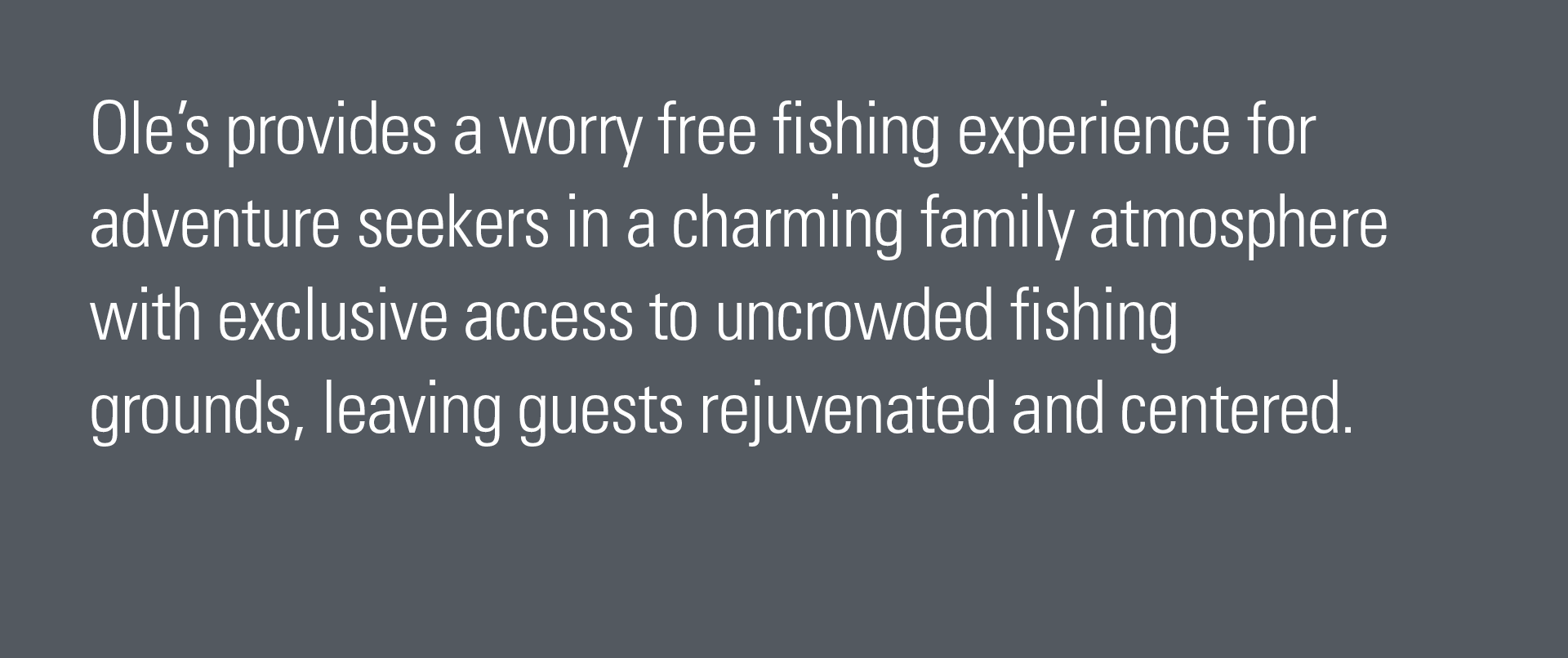
A new logo, brand film, website and marketing materials that supported Ole’s as the premiere Canadian fly-in fishing lodge that caters to adventure seekers looking to recharge and reconnect.
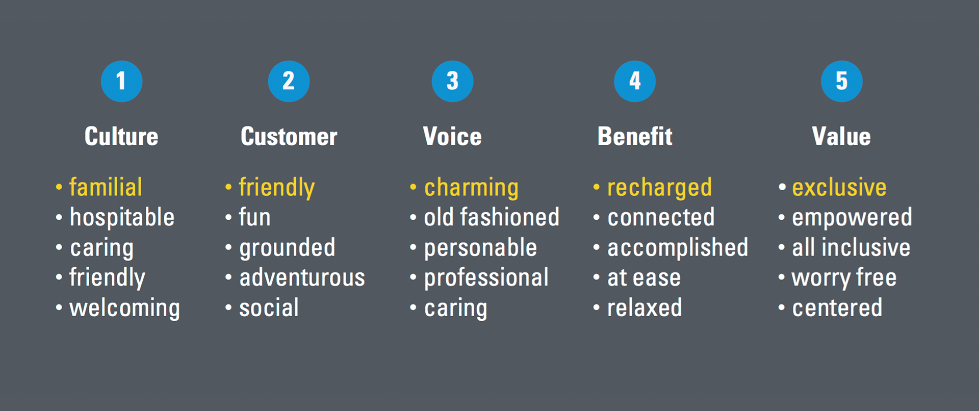
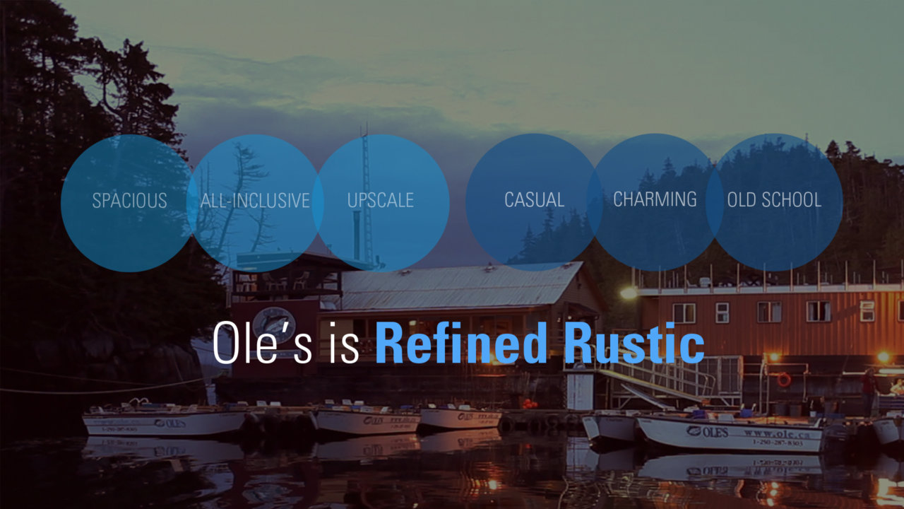
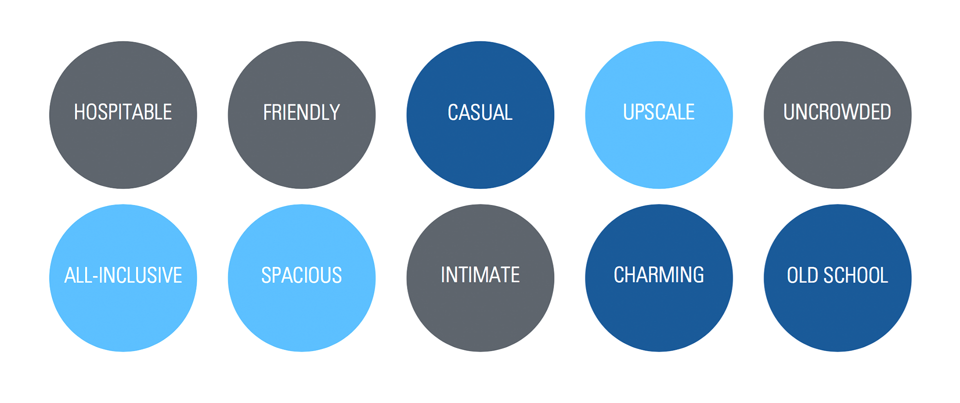 During the brand attributes exercise, a pattern emerged in the cluster of words. "Upscale, all-inclusive and spacious" spoke to a more bespoke experience, while "Casual, charming and old-school" touched upon the old fashioned values of this family owned and operated lodge.