10 Typography Rules
How can you quickly apply typographic rules to regain control of your layouts by following these 10 golden rules of typography? These rules are distilled down from the things that I learned by going to Art Center College of Design.
Generally speaking, there are two types of typography– expressive typography (type is visual, carries the meaning of the word and sometimes appears as physical shapes) and functional typography (type that is meant to be read). I will focus on the latter.
When starting out, it is best to learn the fundamentals of good design: hierarchy (primary, secondary and tierchiary reads), flow (how a person “reads” the layout by following the movement of their attention), legibility (in Western culture, type is read top to bottom, left to right so it’s important to arrange type accordingly), grouping (organizing blocks of type in intelligent and logical groups) and interest, achieved through contrast (scale, texture, color, density, negative space).
Rule 01
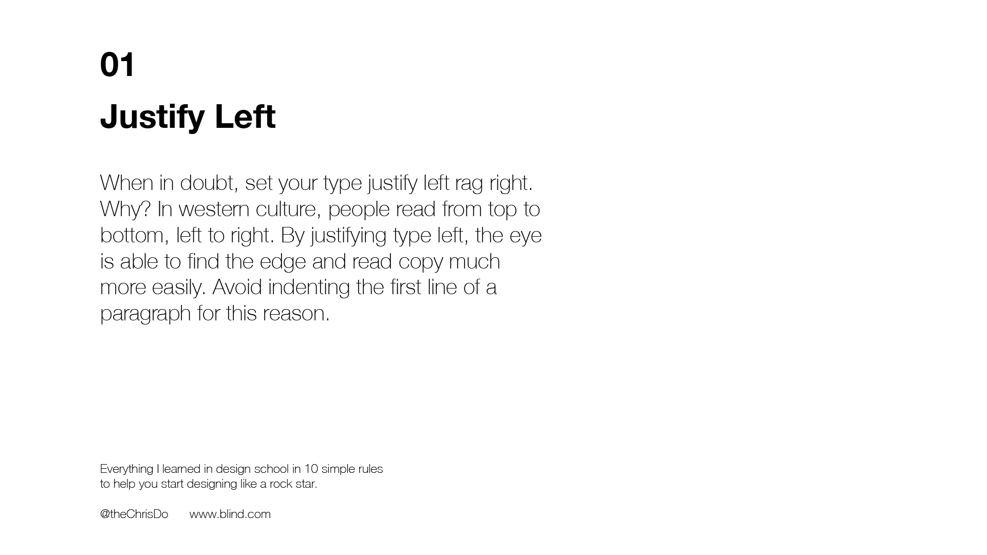
When in doubt, always justify type left, sometimes right (appropriate for aligning currency figures), but never force justify (popular in newspaper columns but creates “rivers” of oddly spaced blocks of text). The reason why you should justify type left is because it is easier to read. The hard left edges make the beginning of paragraphs easier to find. For that reason, I also prefer not to indent the first line of a paragraph. Instead, I prefer adding an extra space after each paragraph.
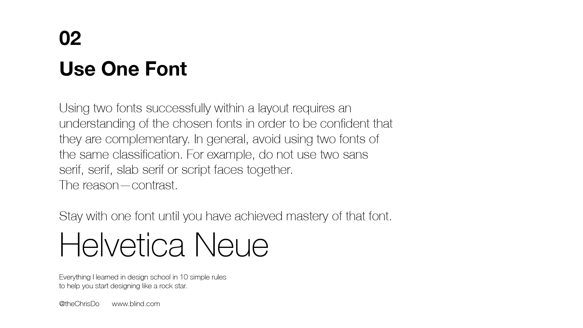
Rule 02
Use one font. Until you have mastered the principles of typography, I would recommend not using more than one font. Reduce the number of options and it will allow you to focus on making a great layout.