How do you Know if Your Idea Sucks?
When you come up with an idea, how do you know if it’s a good one? Is it an idea worth pursuing, or is it a dud to be filed in the trash?
As designers, we face this challenge on every project. We fear going into presentations, because the ideas we gave birth to will face judgement. Somedays you feel like you’ve found a diamond in the rough. “I am a genius!” While other days, your ideas feel like garbage. “Why can’t I figure this out?”
Put it to the test
After working in the design industry for over a decade, I’ve come up with a formula to evaluate my own ideas. I ask myself these 3 questions at every stage in the design process.
Does it achieve the goal?
Is the information and story clear?
Is it interesting?
From the initial pitch, up to delivery day. I use this formula to test, filter, and refine my ideas. It gives me confidence that I’m delivering something of value to my clients, and the intended audience.
1. Does it achieve the goal?
At the beginning of the project, you established a clear goal. What this needs to do. Who it’s for. What they need to walk away with. This is the problem you’re trying to solve.
If you’re lacking clarity on what the goal is, stop designing. Go back to your client and diagnose the real problem. Dig in deep and ask clarifying questions. Surface the challenges getting in the way from your clients being able to achieve their goals.
You, as well as your client, will use this as a primary metric to evaluate your ideas. Your ideas aren’t viable solutions until they pass this first key test.
2. Is the Information and Story Clear?
Is the message coming through? Is the hierarchy of information in the right order? Does this make the audience feel something?
A great way to test this is to show your work to an outsider. Someone similar to your target audience. Without explaining much (other than context), what did they think your work was about? What did they read first, second, third? How did it make them feel?
If your audience isn’t getting what you intended, chances are your you’re trying to say too many things or your message is buried too deep. Go back to your goal. Edit and simplify. Make sure your fundamental message resonates. If it doesn’t pass this second test, whatever you’re designing will be ineffective.
3. Is it interesting?
Does it prompt you to think? Does it challenge you? Are you connecting two disparate ideas to create a new meaning?
If you’ve passed the first two tests, your idea has addressed the challenge. For conservative projects, that’s all it needs to do. Congrats! But in the field of design, marketing, and advertising, we’re challenged to do more. To cut through the noise and grab attention. To instill desire and build intent. To recruit our audiences to act.
What I’ve come to learn is that the most creative ideas are the ones that surprise you. In Chris Do’s article, “Can Creativity be Taught?”, he sums it up nicely:
“To me, creativity is the ability to connect two or more disparate ideas to create new meaning. The whole is greater than the sum of the parts.”
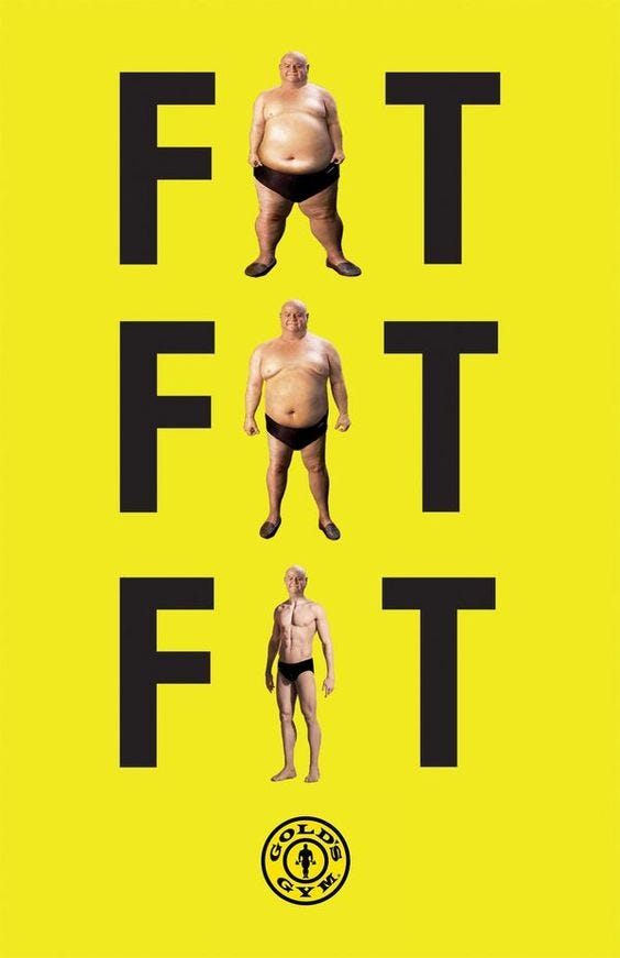
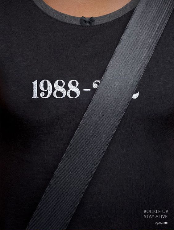
Here are a few great examples that demonstrate this idea:


The next time you’re on the fence about your ideas, test it with these 3 questions. It should save you time, cut through the fat, and help your course-correct when you’re lost.
About the Author
Matthew Encina is a creative director at Blind, focusing on brand strategy and video content. He also authors content on pitching, design, and animation forThe Futur Network.
Follow him everywhere @matthewencina

For those of you who have to pitch creative ideas to win business, but are struggling to land these opportunities, check out The Pitch Kit. I created this for those seeking clarity and structure in their design and pitch process.
